Melissa
Photography portfolio and blog platform featuring optimized image presentation, Sanity CMS for independent content management, and mobile-first design with dark/light mode support.
Key Achievements
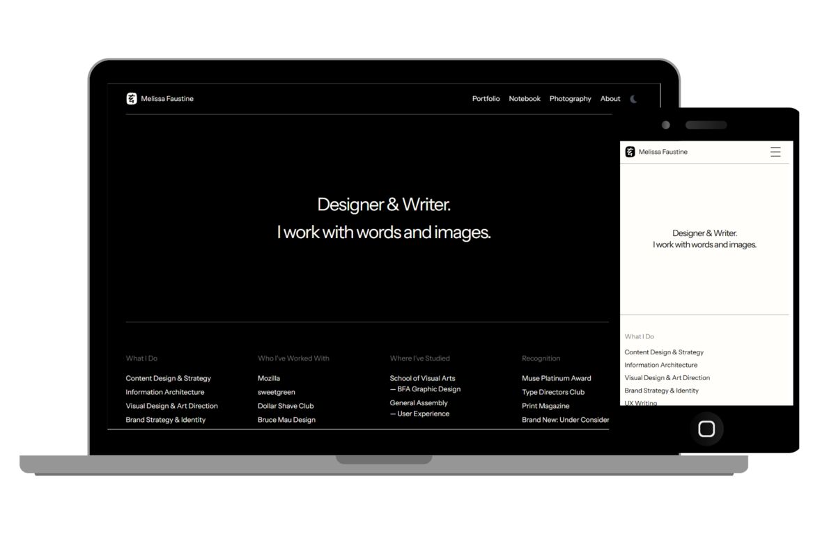
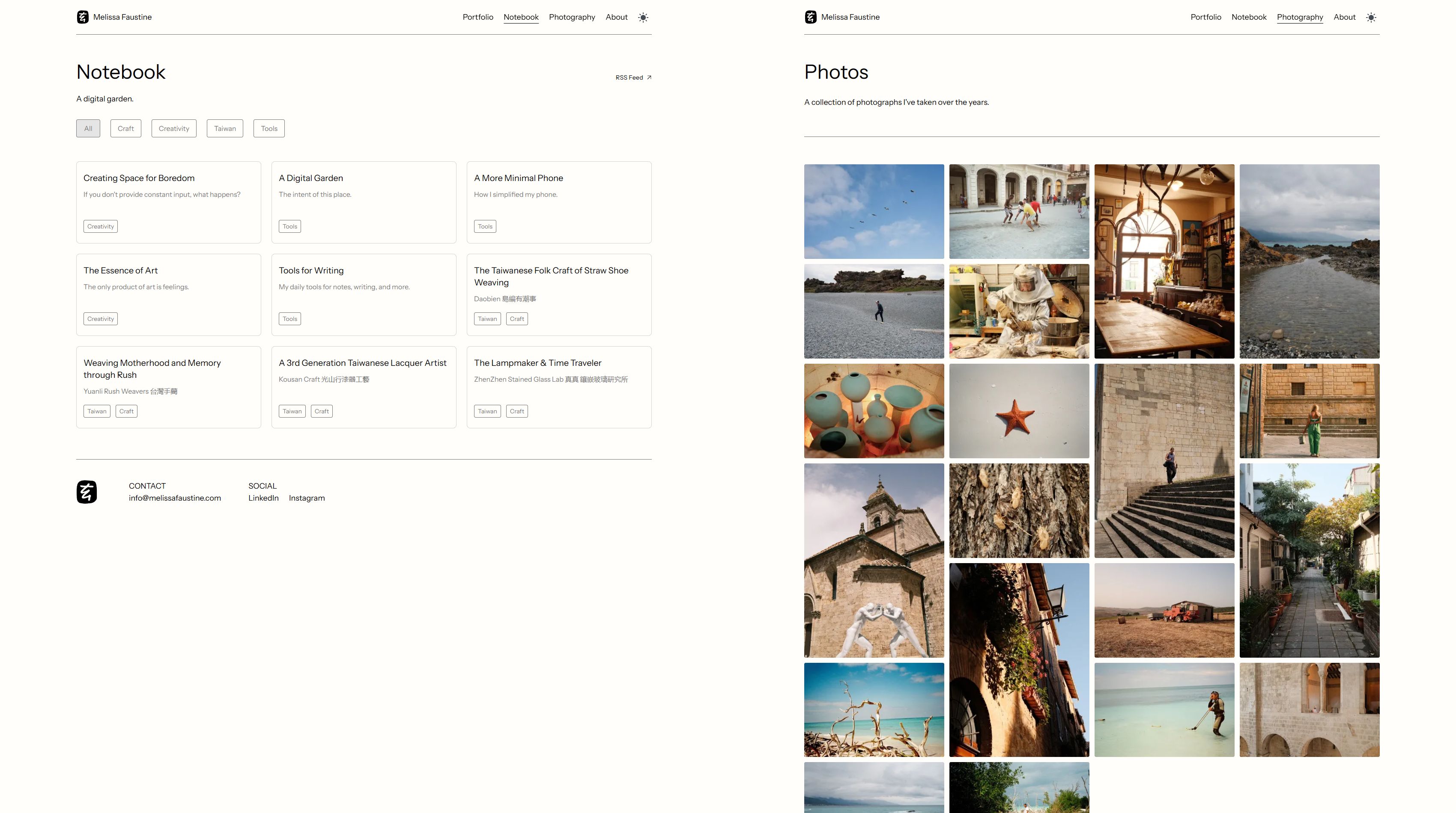
Photography-Focused Platform: Successfully developed modern web platform showcasing photography portfolio and blog content with optimized image presentation and mobile-first design approach.
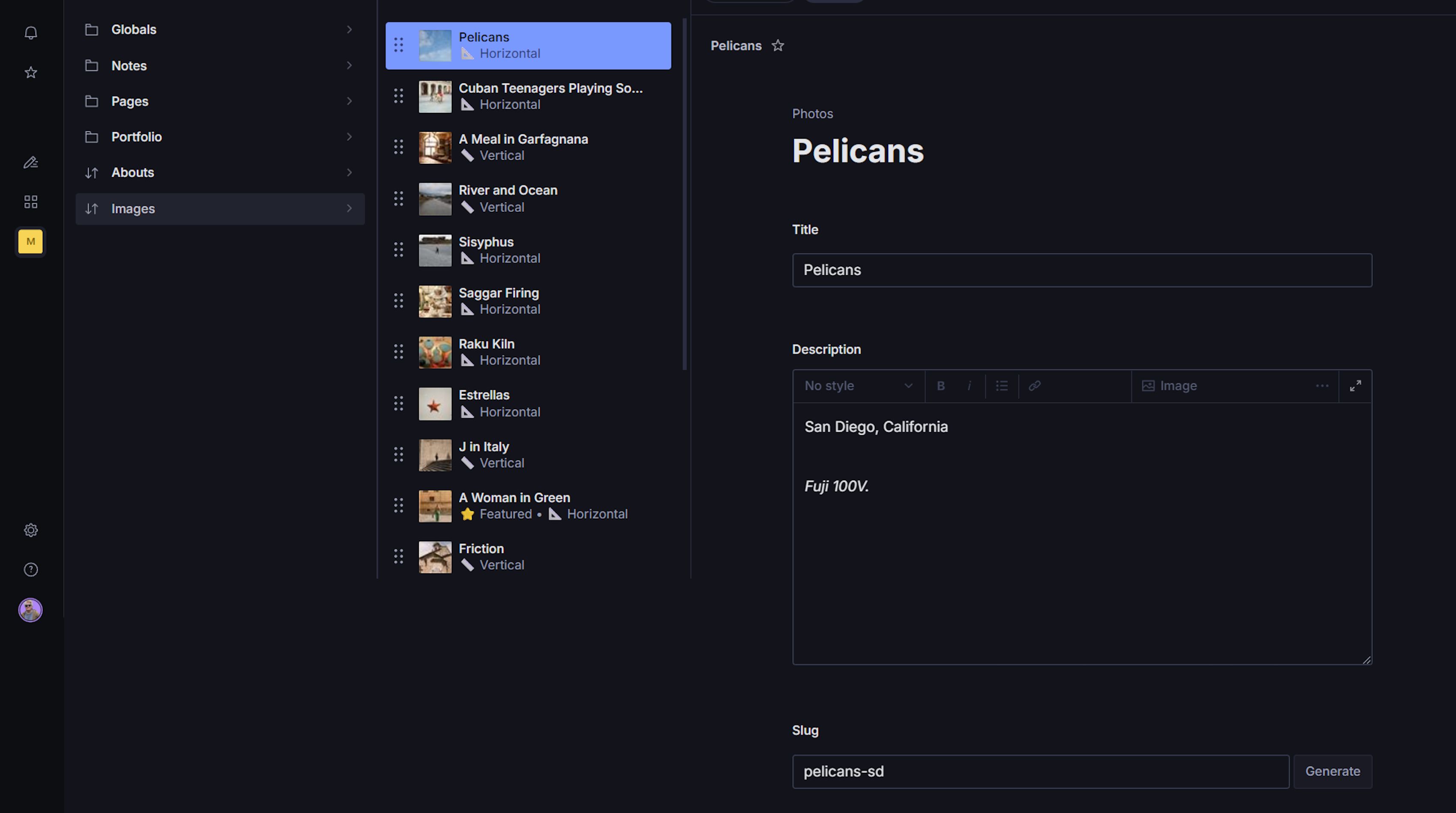
Integrated Content Management: Implemented Sanity.io headless CMS enabling client to independently manage photography collections, blog posts, and website content without developer dependency.
Mobile-Optimized Experience: Created fully responsive design prioritizing mobile users with touch-friendly navigation and optimized image loading for various device sizes.
Performance Optimization: Achieved fast load times through Astro’s static site generation and optimized image delivery, crucial for photography-heavy websites.
Seamless Content Workflow: Established efficient content management system allowing for easy updates to photography galleries and blog content.
The Challenge
Melissa, a photographer and content creator, faced challenges with establishing an effective digital presence for showcasing work and sharing insights:
- Visual Presentation Limitations: Difficulty effectively displaying photography portfolio with optimal image quality and loading performance
- Content Management Constraints: Limited ability to independently update photography collections and blog content without technical assistance
- Mobile Experience Issues: Poor mobile responsiveness affecting user engagement for audiences accessing content on smartphones and tablets
- Performance Bottlenecks: Slow loading times for image-heavy content impacting user experience and bounce rates
- Brand Identity Gaps: Inconsistent visual presentation failing to effectively communicate artistic style and professional photography services
My Approach
I implemented a creative platform strategy focused on:
- Visual-First Architecture: Prioritizing stunning image presentation while maintaining fast load times through optimized asset delivery and modern web technologies
- Mobile-Optimized Design: Building responsive interface with touch-friendly navigation and mobile-first approach for content consumption
- Flexible Content Management: Implementing Sanity CMS for independent management of photography collections, blog posts, and website content
- Performance Optimization: Leveraging Astro’s static generation and strategic image optimization for fast loading despite visual content density
- Brand Consistency: Establishing cohesive visual language that effectively communicates artistic style and professional photography services
My Solution
Technology Stack Implementation
Astro Framework: Utilized for superior performance and modern web standards, enabling minimal JavaScript shipping while maintaining rich visual presentation capabilities.
Sanity.io CMS: Integrated headless content management system providing flexible content modeling for photography collections, blog posts, and dynamic website content.
Tailwind CSS: Implemented utility-first styling approach for rapid development and consistent design system ensuring visual cohesion across all device types.
Image Optimization: Deployed strategic image loading techniques and optimization methods to balance visual quality with performance requirements.
Mobile-First Design: Prioritized mobile user experience with responsive design patterns and touch-optimized interface elements.
Key Features Delivered
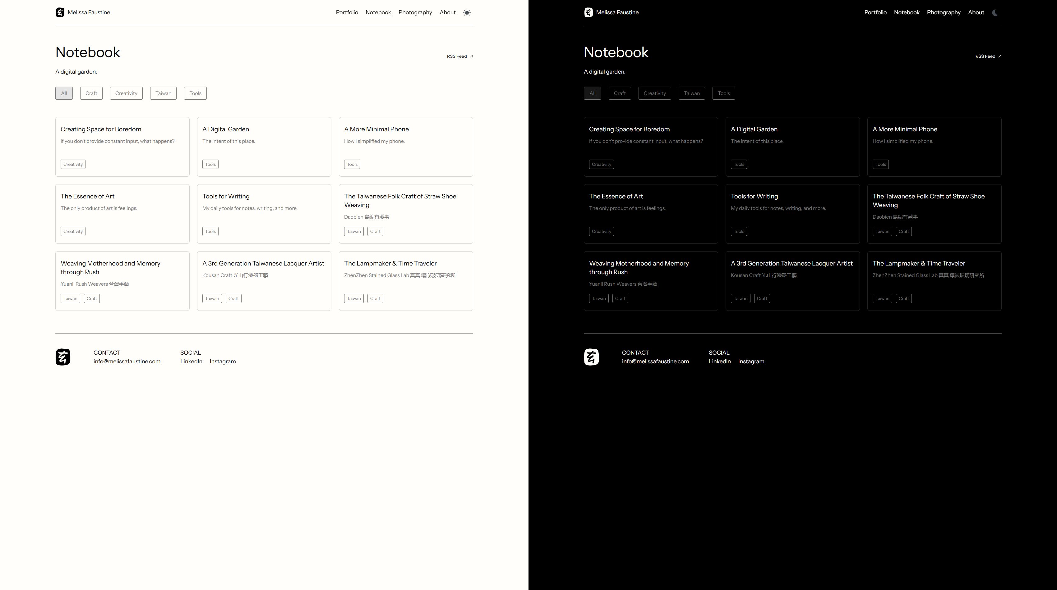
- Dark & Light Mode: Created dynamic dark and light themes for enhanced user experience and visual appeal.
- Photography Portfolio System: Created dynamic galleries and collections with flexible categorization and presentation options
- Blog Content Management: Implemented MDX-based blog system with reusable components for consistent content presentation
- Mobile-Responsive Interface: Developed touch-friendly navigation and mobile-optimized layouts for seamless content consumption
- Image Performance Optimization: Implemented lazy loading, responsive images, and optimized delivery for fast load times
- Independent Content Updates: Enabled client to manage photography collections, blog posts, and website content without developer assistance
Measurable Results
Performance Achievements:
- Significantly improved page load times compared to typical photography websites
- Optimized image delivery balancing visual quality with performance requirements
- Enhanced Core Web Vitals scores through strategic asset optimization
- Improved mobile performance for better user engagement on smartphones

User Experience Enhancements:
- Seamless mobile experience with touch-friendly navigation and responsive layouts
- Improved image presentation capabilities for effective portfolio showcasing
- Enhanced content discovery through intuitive navigation and organization
- Better accessibility across all device types and screen sizes
Operational Efficiency:
- Client independence in content management across photography collections and blog posts
- Eliminated developer dependency for routine content updates and portfolio additions
- Streamlined workflow for adding new photography work and blog content
- Reduced time-to-market for new content and portfolio updates
Brand and Visual Impact:
- Established cohesive visual language effectively communicating artistic style
- Enhanced professional presentation of photography services and creative work
- Improved audience engagement through better visual storytelling
- Strengthened online presence supporting photography business growth and client acquisition