Now & Here
A public storytelling platform exploring American history, culture, and memory — built with performance-first architecture and a clean editorial design.
Key Achievements
Editorial Platform Delivery: Built a public storytelling hub for Mellon fellows to publish and share stories rooted in American history, culture, and memory — balancing rich content with fast load times.
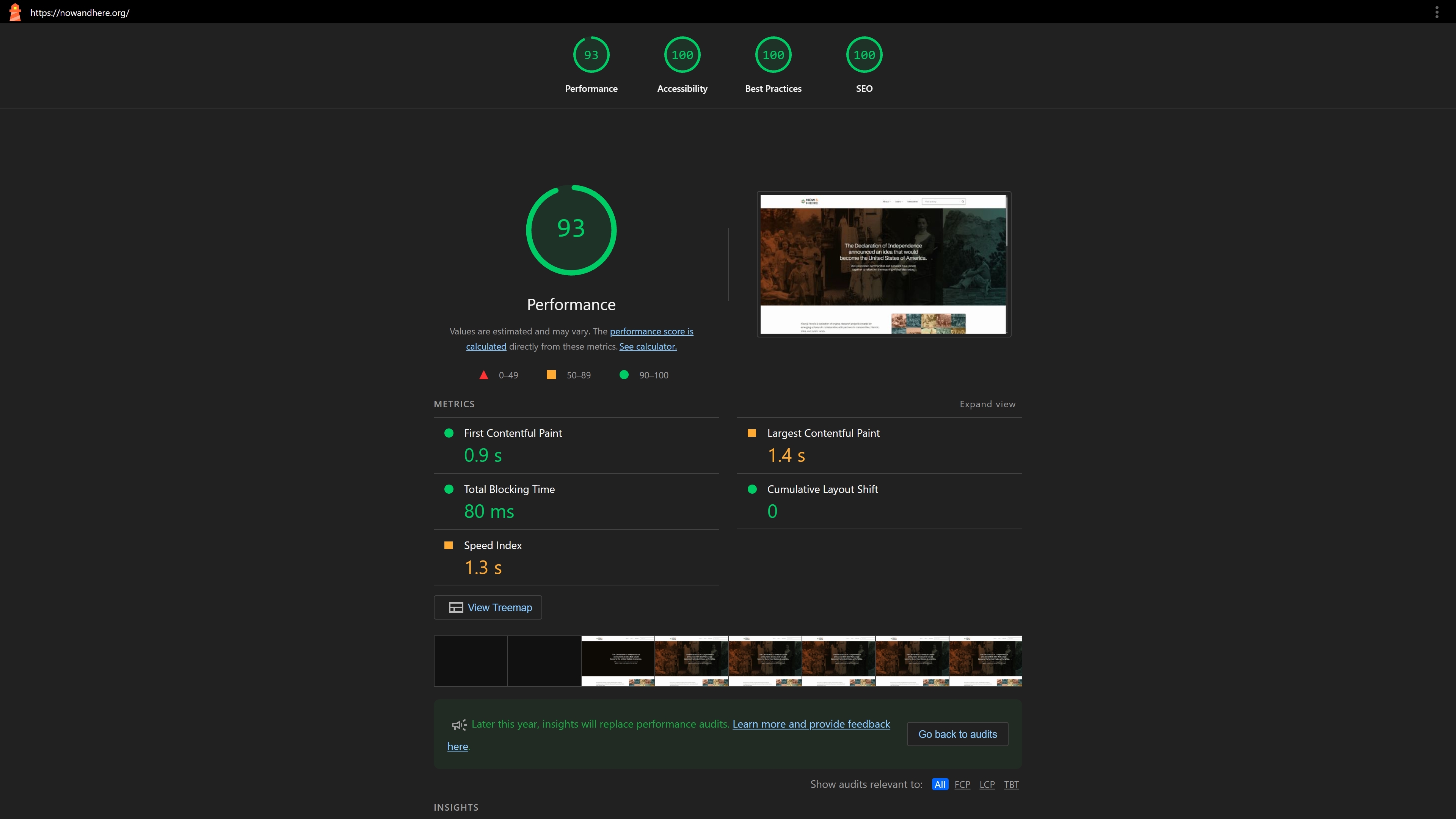
Performance-First Architecture: Leveraged modern static site generation to achieve excellent Core Web Vitals, ensuring fast delivery of content-heavy editorial pages across all devices.
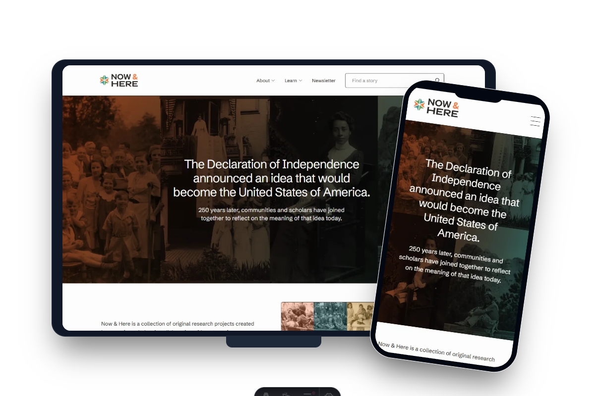
Responsive Design System: Designed a fully mobile-optimised layout that adapts cleanly from desktop to handheld, maintaining readability and visual hierarchy at every breakpoint.
SEO & Discoverability: Implemented structured data, semantic HTML, and optimised meta tags to maximise search visibility for stories and historical content.
The Challenge
The client needed a platform that could:
- Serve rich editorial content without sacrificing page speed or user experience
- Present long-form storytelling in a visually engaging, readable format
- Scale across contributors — Mellon fellows publishing independently with consistent presentation
- Perform well on mobile where a significant portion of readers consume long-form content
My Approach
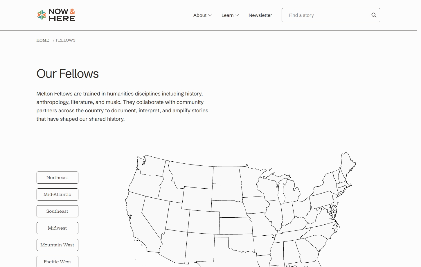
- Content-First Architecture: Structured the page hierarchy around the reader’s journey — discover, read, explore related stories
- Asset Optimisation: Modern image formats and lazy loading to handle rich media without performance penalties
- Typography & Readability: Carefully selected type scale and line lengths for comfortable long-form reading
- Semantic Markup: Clean HTML structure to support both accessibility and search engine crawling
- Component-Based Build: Reusable layout components ensuring visual consistency across all contributor pages
My Solution
Technology Stack Implementation
Astro: Chosen for its zero-JS-by-default approach — perfect for a content-heavy editorial site where fast initial load and SEO matter most.
Tailwind CSS: Utility-first styling enabled rapid iteration on the editorial design system while keeping the CSS bundle lean.
Static Generation: All pages pre-rendered at build time for maximum performance and reliability — no server-side bottlenecks.
Optimised Images: Astro’s built-in image optimisation pipeline handles responsive images and modern formats automatically.
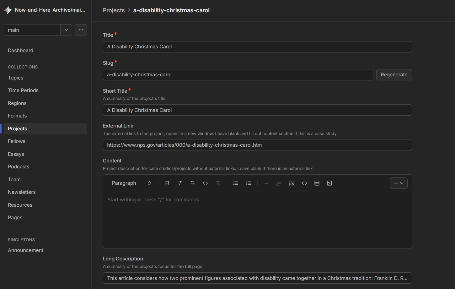
Keystatic CMS: Integrated Keystatic as the content management layer — a Git-based CMS that gives Mellon fellows a clean, accessible editing UI without requiring any developer involvement. All content changes commit directly to the repository, keeping the full editorial history in version control and eliminating the need for a separate database or hosted CMS service.
Key Features Delivered
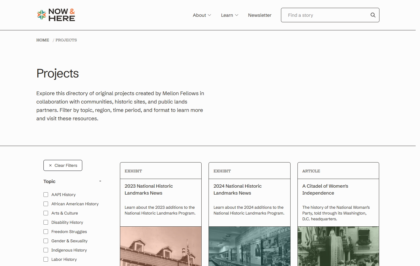
- Editorial Story Layout: Clean, distraction-free reading experience with strong typographic hierarchy
- Responsive Design: Seamless experience from wide desktop to mobile viewports
- Fast Page Loads: Pre-rendered static pages with optimised assets
- SEO Foundation: Meta tags, Open Graph, and structured data for each story
- Contributor Consistency: Uniform presentation regardless of individual contributor content
Measurable Results
Performance:
- Excellent Core Web Vitals across desktop and mobile
- Near-instant page loads via static generation
- Optimised image delivery reducing bandwidth usage
Reach & Discoverability:
- Strong search visibility for historical and cultural content
- Open Graph integration enabling rich social sharing previews
User Experience:
- Comfortable long-form reading experience across all devices
- Clear navigation between stories and contributors
I've worked on a few projects with Joe now, and he is terrific to work with. This particular one was a complicated, detail-oriented client project and it was no exception. Not only is he an excellent and skilled developer, he is also an excellent communicator. He is always receptive to feedback and a great problem-solver, no matter how big or small the ask. As a designer, I am nitpicky about many things, and I find Joe to be a wonderful collaborator. I look forward to working with him in the future again.